A complete retro-futurist café brand — from identity and visual system to a fully designed Figma website for a fictional NYC coffee shop with two Brooklyn locations.
.png)
A self-directed brand exercise — finding the identity of a gym trainer and his services, then translating it into a Figma web design that could be built and transferred to the web easily.
Most café websites feel either too minimal or too cluttered. Atomic Sips needed a brand that felt genuinely unique — retro-futurist, warm, and playful without losing credibility as a real food and beverage business.
Build a visual world first — Bubblegum Pink meets Space Age Teal, Pacifico for the warmth, Righteous for the energy. Then design five pages that feel like stepping into a café from another era, on a screen.
Before designing a single page, a complete visual system was built — color, typography, spacing, UI components, and brand voice — all documented in Figma.
.png)
Five pages designed in Figma — each one built to show how ForgeBody's identity translates across a real website.
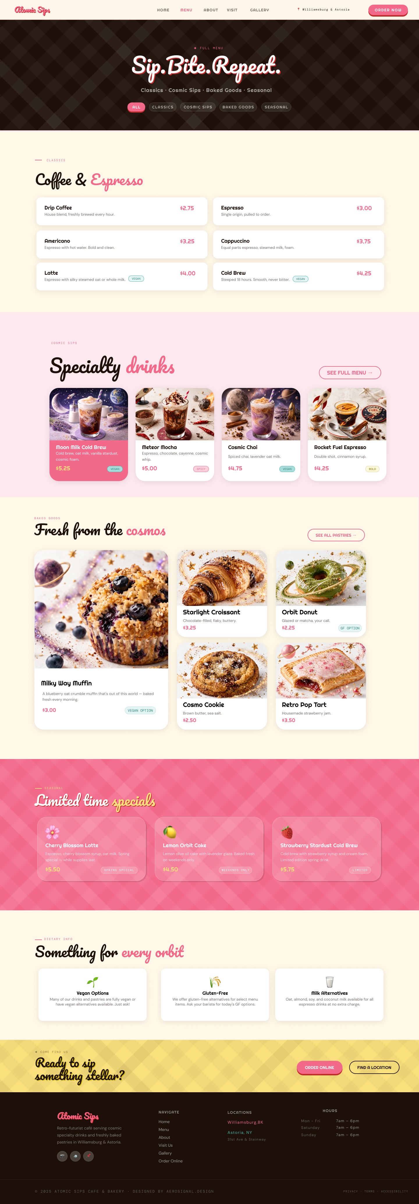
.png)
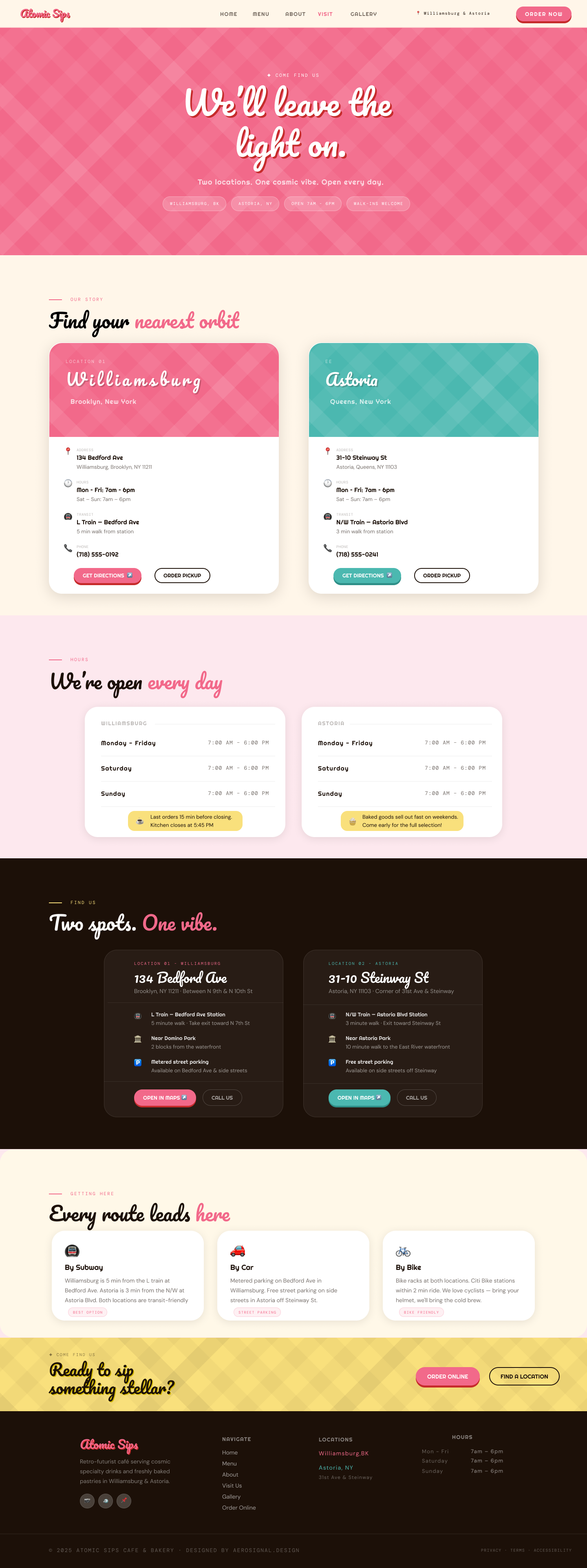
Every decision started with the café's world — not the design.
Defined the café's personality — retro-futurist, warm, neighbourhood-rooted. A place that feels like a 1950s diner crossed with a space age dream.
Built a complete brand guide — Bubblegum Pink, Space Teal, Butter Yellow, custom patterns and motifs — before touching a single page layout.
Built browser-accurate HTML previews for every page first. Each section approved visually before committing to Figma — no surprises at the design stage.
Designed all five pages in Figma with the structure, spacing, and components a developer needs to build it — faithful to the brand system throughout.