A complete brand identity for a fictional NYC gym trainer — discovering who he is, what he stands for, and translating that into a Figma web design ready to be built.
.png)
A self-directed brand exercise — finding the identity of a gym trainer and his services, then translating it into a Figma web design that could be built and transferred to the web easily.
Most personal trainer websites feel generic and template-driven — stock photos, vague copy, no real identity. ForgeBody needed to feel like a premium performance brand that actually reflects who Alex is and what he stands for.
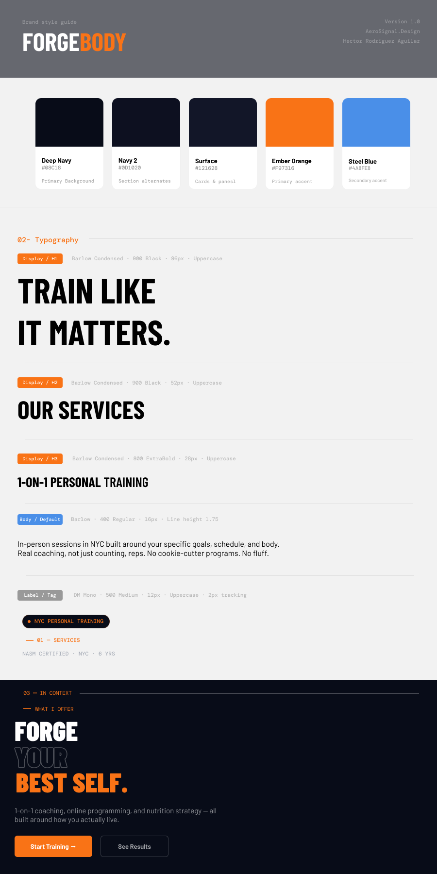
Start with identity, not aesthetics. Define the trainer's voice, values, and positioning first — then build a visual system around it. Dark navy for discipline, Ember Orange for energy, Barlow Condensed for the athletic conviction of every headline.
Before designing a single page, a complete visual system was built — color, typography, spacing, UI components, and brand voice — all documented in Figma.
Five pages designed in Figma — each one built to show how ForgeBody's identity translates across a real website.
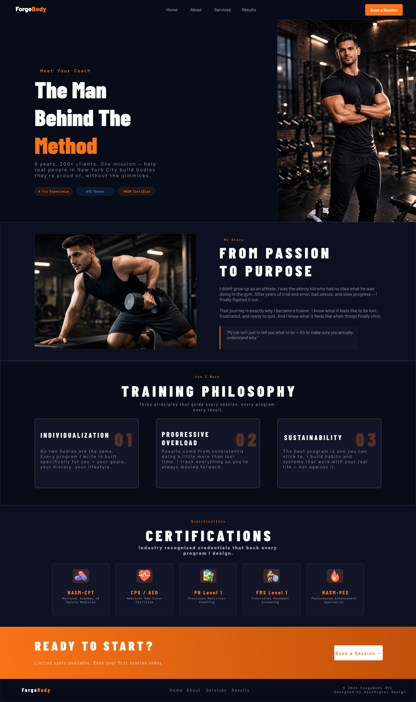
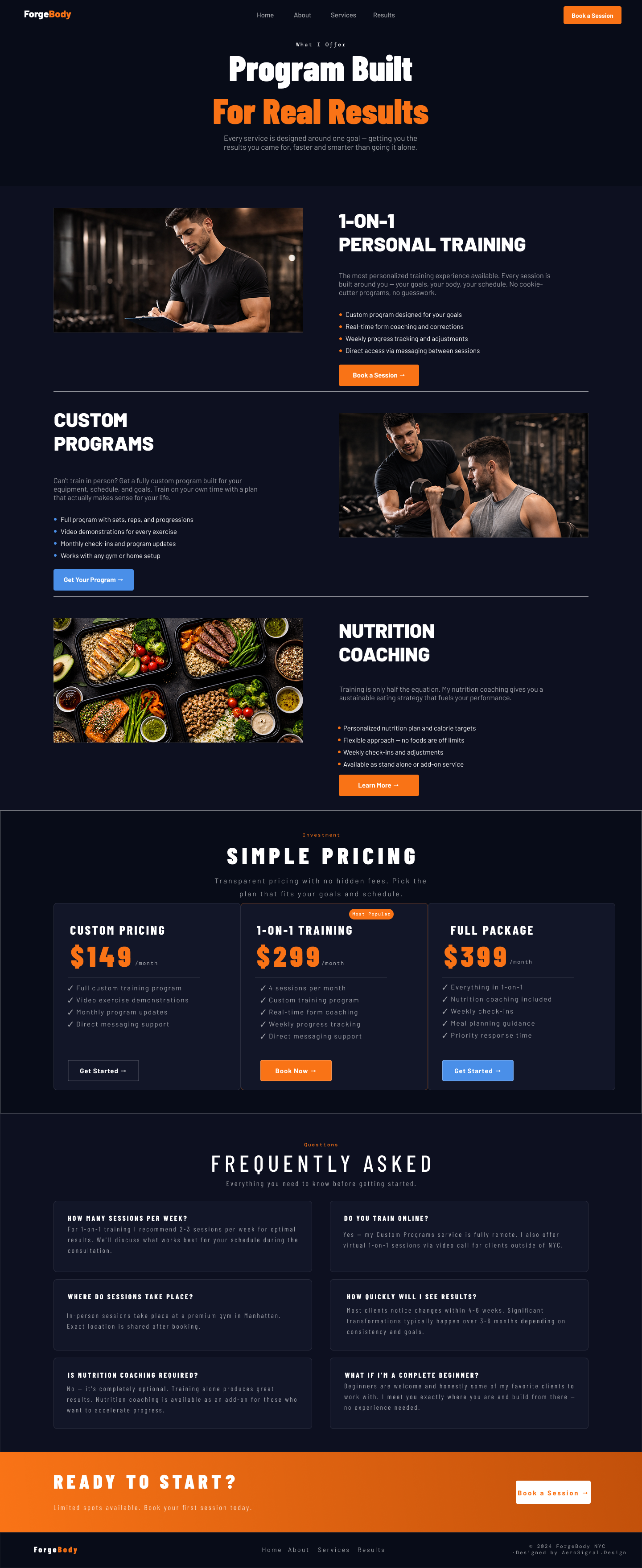
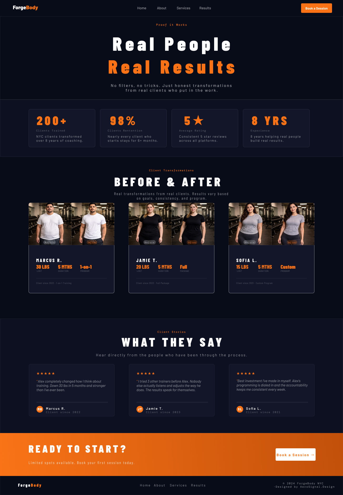
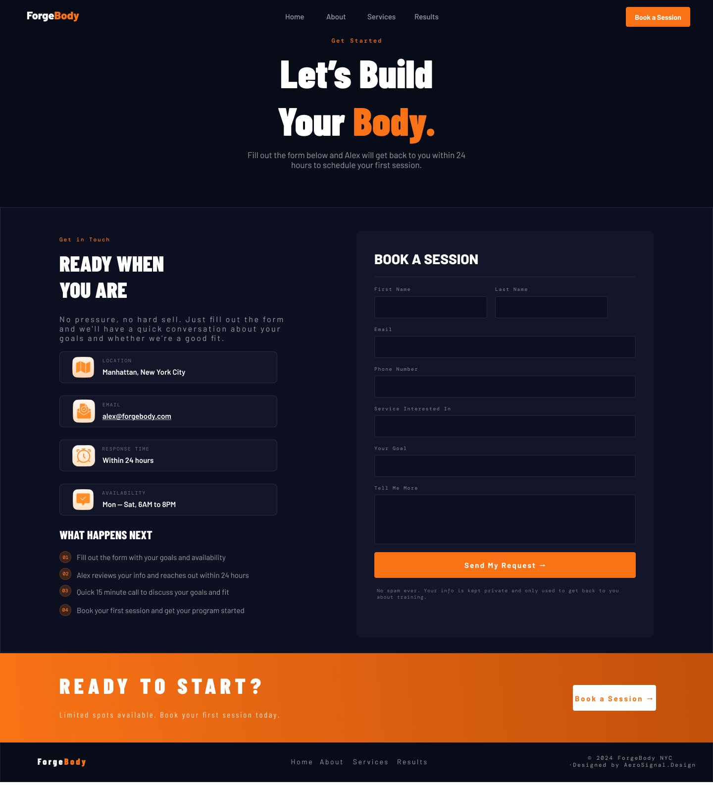
Every decision started with the trainer's identity — not the design.
Defined who Alex is — his values, training philosophy, voice, and the type of client he serves. Everything visual had to reflect a real person, not a generic trainer archetype.
Translated that identity into a complete brand guide — color palette, typography, UI components, and brand voice — all before a single page was touched.
Built browser-accurate HTML previews for every page first. Each section was approved visually before committing to Figma — no surprises at the design stage.
Designed all five pages in Figma with the structure, spacing, and components a developer needs to build it — clean, transfer-ready, and faithful to the brand system.